It bears repeating:
"A picture is worth a thousand words." And clear, clean, meaningful graphics say it best. They quickly speak volumes of great things about your company to your busy viewers.
Graphics can include almost anything that is not text: original drawings, photographs with custom lettering and borders, slideshows with captions and links, logos, handwriting in a graphic format, buttons, backgrounds and, well, you get the idea. These elements help build your identity, or brand, and that can be key for success in today's business climate.
graphics portfolio
good impressions we've helped to make
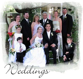
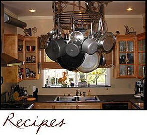
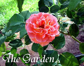
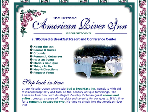
We enhanced these four photos with different stylized lettering
and one with a special border in keeping with the innkeeper's eclectic style
We created a custom splash page showcasing some of Bonnie's favorite images of
the inn, with a watercolor border and stylized lettering, all anchored with a round blue-and-white bird graphic she liked.
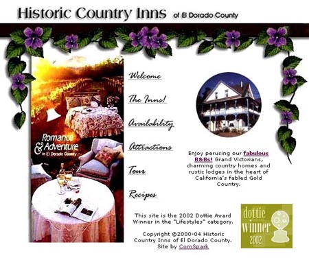
We designed the graphic below with a flowering vine "hanging" from a trellis
superimposed over the inns' brochure photo. A circular slide show, showcasing all the member inns, played under the vine. Their "Romance & Adventure" theme was carried throughout the website.
It was impossible to design the Blair House Carousel Inn website
without making this 'real live' carousel horse animation.
Just impossible!
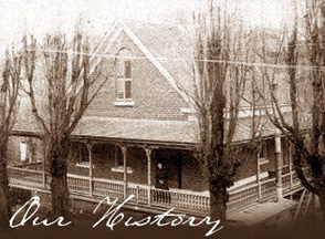
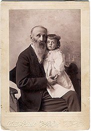
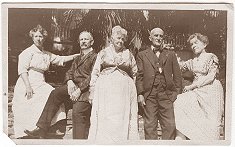
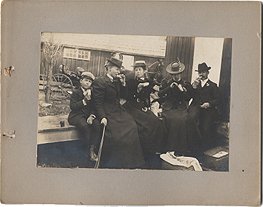
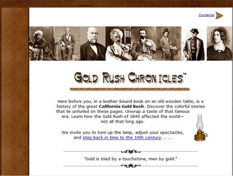
We scanned these historic photos, then manipulated the files for the Web,
keeping their discolorations, tattered corners, asymmetry, and creases
to coordinate with the "aged" ambiance of this historic inn.
Left: Daguerreotypes, photographs developed on silver or silver-plated copper plates, can also be scanned and manipulated.
Virtually any photograph or document can be modified in a graphics editor, even "aged" with sepia-tone, noise, "ink" stains, and other after-market effects.
Back in the days before Photoshop, pictures could also be modified. Someone added rosy cheeks to this chap on his 1860 daguerreotype. (We didn't add the blush, honest!)
The page border below was made to match the inn's architecture.
And we
made a Victorian wallpaper background for the website to match the corner roses.
The header below shows who this organization is and what they do by combining their oval logo,
a snowy Sierra photo
and, in the foreground, a picture of Walt, their beloved telemark skier
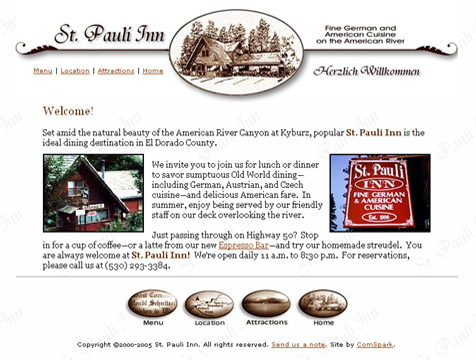
This website header was made from a drawing of the St. Pauli Inn Restaurant put in an oval with custom lettering added.
Below the header are matching oval navigation buttons,
all in
sepia-tone for this historic restaurant and inn.
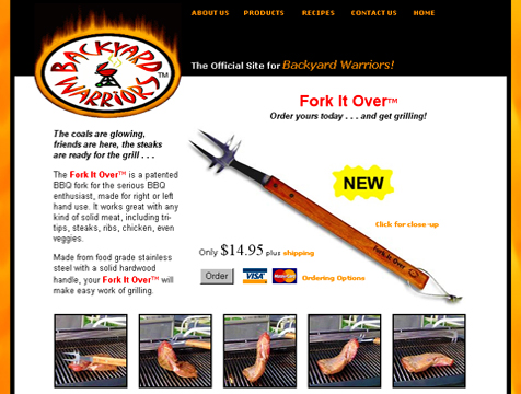
BBQ-appropriate tag line made with "fire" lettering and "flames"
and "smoke" effects.
Then we ignited their oval logo with "flames" in
keeping with their "Get Your Grill On" theme.